ENTER THE RESTRICTED AREA
Need access but don't have the login/password? Reach out to me on LinkedIn!
D1 DIGITAL JOURNEY
Introduction of a push notification channel into a web-based B2C solution can help big enterprises, such as banks and insurance providers, communicate more effectively with their customers.
At Zenvia, I worked on a product called “D1 - Digital Journey”. The company’s mission is to help large businesses communicate better with their customers, improve efficiency, reduce operational costs, and enhance their customers experience.
The Product
D1 - Digital Journey offers a web-based B2C solution that helps big enterprises, such as banks and insurance providers, communicate effectively with their customers. It also ensures a reliable record of communication, documents contracts and other sensitive materials.
In the product, users can create a complete automated journey to communicate with clients in their database, starting with an SMS, then an email, and even a call with an actual person if needed.
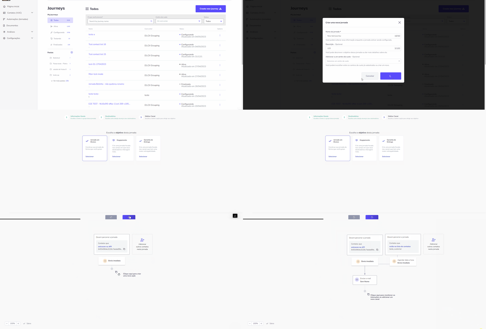
User creating a flow to automate the comunication with their clients.
My Role There
As the Principal Designer of this SaaS web application, I was responsible for providing guidance and support to 5 different development squads, which consisted of over 30 developers. I worked on the entire process from discovery to delivering designs to developers, and also provided support during implementation.
Push Notification Channel
One of my greatest efforts during my time at Zenvia was the introduction of push notification functionality, which would allow users to send notifications directly to their clients mobiles.
The video above shows the feature MVP in a high-fidelity prototype, created on Figma, which I used for usability testing. Here, users can customize their messages by using images and pre-configured variables that access the information they have on their clients in the database.
Usability Testing
During the course of the usability test, I utilized the System Usability Scale in order to more thoroughly evaluate the overall user experience and identify potential areas for improvement. This proven tool allowed me to gather a range of data and metrics that provided valuable insights into the user’s interaction with the system, including their level of satisfaction with the interface, the ease with which they were able to perform key tasks, and their overall perception of the system’s efficiency and effectiveness. By leveraging this approach, I was able to generate a detailed and nuanced understanding of the user’s experience, which in turn provided a solid foundation for making informed design decisions and enhancing the usability of the system as a whole.
As the Principal Designer on the D1 - Digital Journey project at Zenvia, I was responsible for the design and delivery of a web-based B2C solution that helped large enterprises communicate effectively with their customers. One of my major contributions to the project was the introduction of push notification functionality, which allowed users to send notifications directly to their clients’ mobiles. I created a high-fidelity prototype of the feature on Figma and conducted usability testing using the System Usability Scale. The insights gained from this testing helped me refine the design and enhance the usability of the system as a whole.
Word & Brown - Core Product UX/UI Redesign
A successful redesign of a mobile-first application into a more user-friendly web app for a large insurance company in California.
This UX/UI redesign project was undertaken at a major California-based insurance and health plan provider. The company had initially developed a mobile-first application for their customers, but it failed to gain traction due to a cumbersome, step-by-step user experience.
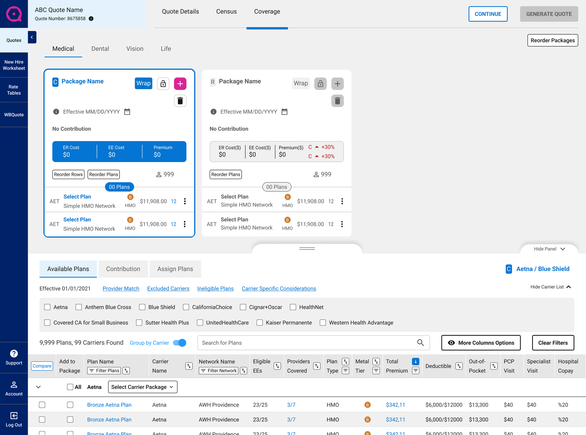
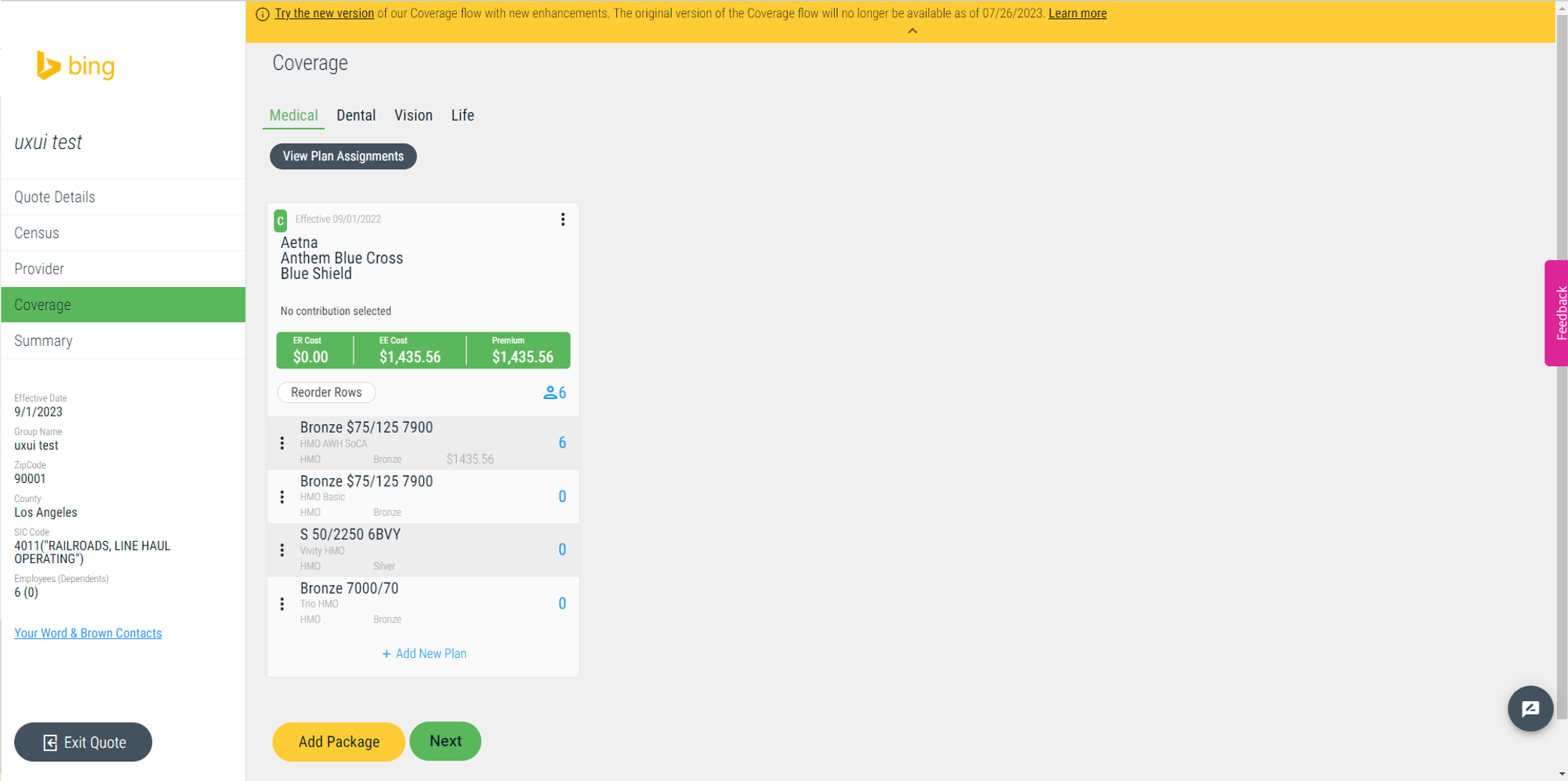
Upon joining the project, my task was to transform this mobile-first design into a more intuitive, all-in-one web app experience that would drive user adoption. This involved a complete overhaul of the user interface, transitioning from a fragmented, multi-screen flow to a streamlined, single-page design.
The Challenge and Solution
The primary challenge was to simplify the complex process of creating a health plan package. Previously, users had to navigate through multiple screens, inputting information piecemeal, without a clear view of the final quote. This approach was confusing and frustrating, leading to high abandonment rates.
To address this, I spearheaded the development of the company’s first Design System, establishing a unified visual language and interaction patterns. This enabled us to create a cohesive and user-friendly interface that guides users through the entire process on a single screen, with the full quote dynamically updating in real-time.
Results
The redesigned web app experience significantly improved user engagement and satisfaction. By eliminating the need to navigate between multiple screens, users can now effortlessly create their health plan packages while having a clear understanding of the associated costs at every step. This streamlined approach has resulted in increased conversions and a more positive overall user experience.
Se a cidade fosse nossa - website
A responsive website designed for a political campaign in Brazil. The goal of this project was to be bold, colorful, and informative, representing the powerful relationship between the candidates and local social movements.

Cool Living - Case UX/UI
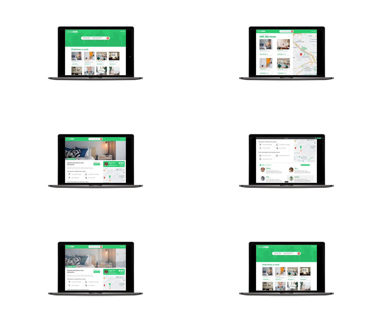
This project was created as part of a job interview process. The task was to create a desktop website to help students find rental places near their college. The project was completed within one day.

Select Component for SaaS Product
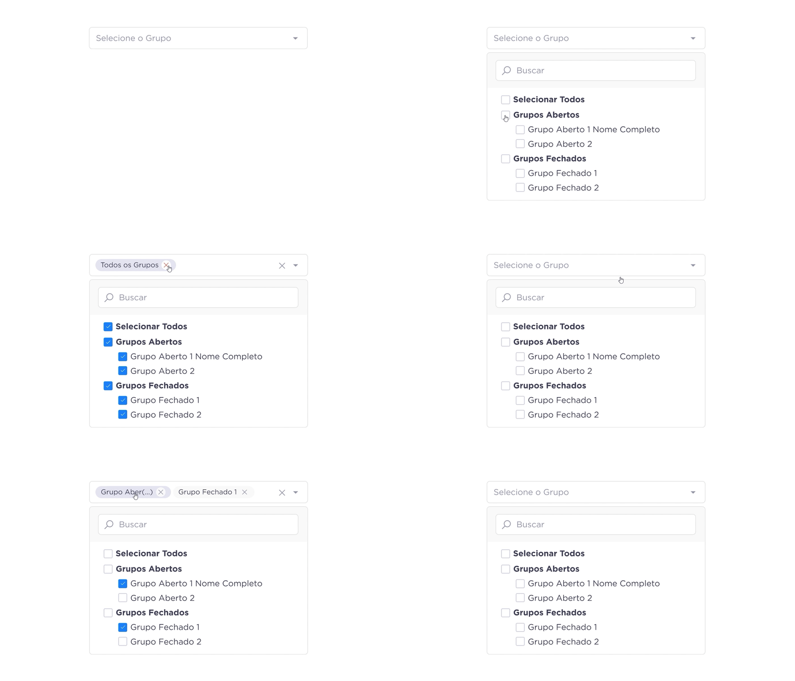
Select component with chips to address a complex situation in a legacy product, using Google Material as a base. This was achieved using an atomic design approach, making it scalable and easy to manage in the design system.
Responsive Website - Health for All
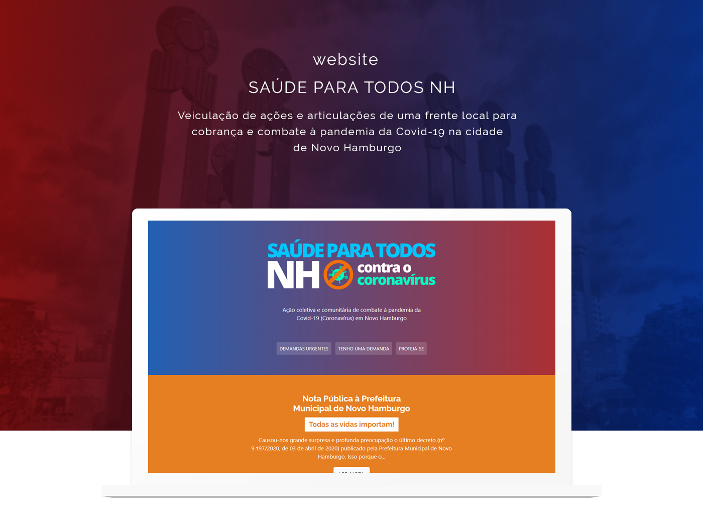
A responsive website created during the pandemic to provide people in my city with accurate information about COVID-19 treatments and care available at our local hospitals and clinics. It also serves as a platform to connect the demands from the population with the city hall.

Responsive Website - Political Campaign
A responsive website designed for a political campaign in Brazil. The goal of this project was to demonstrate that the proposed candidate aligns with youth social movements and to garner support through signatures.

